

Most approaches to displaying search results create a list of results with some fixed order. Missing is the ability to explore common topics within the set of search results. This paper examines techniques to solve this problem and introduces SQWID, a system that uses many of these techniques. The SQWID (Search Query Weighted Information Display) system provides an interactive visualization of the search results, allowing users to see the relevance of the results to different key terms.Keywords: WWW, search, visualization, query, interactive, SQWID
The list-based structure of search results offers little to assist the user in browsing large sets of pages. The user must process the results linearly using a single fixed ordering scheme. Even though the search engines record much of the information about a page, very little of it is communicated to the users. At best, a search engine will suggest terms or topics that are related to the query results, and the user must submit a new query and restart the browsing process. In many cases, the user is simply left to wonder why a page matched the query and what the common topics in the set of results could be. Ideally, users should be able to dynamically adjust the emphasis of terms in the result set to view the results from different perspectives.
A graphical visualization of the search results could assist in communicating this type of information. A visualization can provide a broad, concise representation of the results which the user can quickly scan to understand why and how the results are related to the query. Ideally, users can then interact with the visualization to obtain sites and pages of interest. Visualization can be particularly useful in interpreting Web search results for several reasons. First, visualization allows for the simultaneous display of a large amount of information, in this case, a large number of Web pages. Second, visual qualities such as color and position can be used to quickly direct users' attention to areas of interest. Clearly, it is not enough to merely display a lot of information simultaneously if it cannot be dealt with easily. Binding quality attributes of the pages to color and position exploits humans' natural ability to identify anomalies and patterns. Finally, spatially compressing nodes from the same site allows users to deal with the results at a coarser grain, namely, the site level rather than the page level. This provides a display where sites can be considered as a whole without obscuring their individual member pages. This paper discusses several systems that use these visualization techniques and introduces the SQWID (Search Query Weighted Information Display) tool, a graph-based system developed to illustrate how these techniques can be used to visualize Web search results.
VIKI is a spatial hypertext system designed by Catherine Marshall and Frank Shipman at Texas A&M University [Marshall95]. VIKI uses spatial orientation instead of physical objects to express relationships between documents. In a spatial hypertext system, rather than use the typical box-and-line display to show relationships, the lines are removed and the relationships are shown with visual cues such as proximity, alignment, and physical similarity. In VIKI, overlapping nodes show a binary link, and nodes of the same color belong to some common set. The user can move nodes around and can nest the nodes to create complex hierarchical structures. These structures can be resized and zoomed to reveal different amounts of their contents. VIKI creates these structures automatically with structure finding algorithms, thus removing this burden from the user. SQWID uses a similar layered approach but with different information relationships within and among the nodes. In SQWID, these relationships are implicitly created based on user choices rather than explicitly formed by the user.
VIBE, the visual information browsing environment, is a program originally developed for visually exploring multivariate data [Olsen93]. The VIBE screen is bordered with circles that represent data attributes. Rectangles representing records are placed on the screen according to their ratios of scores for the attributes. The VIBE user can select rectangles to get more information about their corresponding records.
When a large number of attribute circles are displayed simultaneously, ambiguity can arise in VIBE and similar visualizations. SQWID uses a similar layout, but limits the number of simultaneously displayed attributes to remove ambiguity. Also, VIBE does not provide any textual information about the retrieved records. SQWID incorporates textual information into the graphical display to facilitate the identification of interesting pages and sites.
Narcissus provides a three-dimensional view of a hypertext information space [Hendley95]. Spheres represent Web pages, and lines connecting the spheres (which can be made invisible) represent links between the pages. Rather than use a fixed graph layout algorithm, Narcissus employs a simulated physical model where nodes and links attract and repel based on their properties and relative positions. The user can navigate through the space to select and manipulate objects of interest. Many features of the display can be controlled by the user, including number of visible nodes and attraction between objects. In addition, Narcissus communicates with a Web browser to provide access to the Web pages being visualized. In this way, Narcissus can act as a secondary application that keeps the user informed of the structure and layout of the hyperspace.
One drawback to using high-level displays of the type in Narcissus in viewing search results is that it can be difficult to determine from the visualizations enough information about specific sites or pages. Since search results are rarely as structured as typical information spaces, SQWID can sacrifice some of the structural information shown in Narcissus and other systems to provide more detailed information about pages and sites.
While knowing the structure of the hyperspace may prove useful in certain situations, it is unclear whether it is necessary for a topical collection of pages such as a search result. WAVE is a system developed by Kent & Neuss which bases its visualization on other document attributes in addition to structure [Kent95]. WAVE (Web Analysis and Visualization Environment) uses techniques from Library Science and Concept Analysis to automatically classify and categorize documents based on location, title, keywords, and other attributes. Documents are organized into conceptual classes and scales; the arrangement of documents in the visualization reflects these relationships rather than the link structure. In addition, other features of the display (size, shape, and color of nodes) are used to encode information about the documents.
Tkinq is a system for querying, navigating and visualizing an
on-line library catalog [Veerasamy96]. The system provides a
simple visualization that displays the total weight (or rank)
for each document along with the weight for each keyword.
For each search keyword along the left side of the figure, there
is a row of bars. Each bar represents a document which was
retrieved by the query and the height of each bar represents
the document's rank for that keyword. A high rank (and therefore
tall bar) indicates that the keyword is very relevant to the document.
The last row represents the total rank for each document which
is some combination of the ranks for each search keyword. Documents
are ordered from left to right in decreasing order of total rank
and bars which are vertically aligned represent one document.
Tilebars is a
visualization technique developed by Marti Hearst at Xerox PARC [Hearst95].
Hearst maintains that ranking the results of a search is
not a very informative way of conveying the relevance of documents in
a search; the notion of relevance is too complicated to be expressed
in a single number (i.e. rank). Tilebars are designed give users a
compact representation of the content of the retrieved documents with
respect to the keywords in the query. They simultaneously display:
the length of the document, the frequency of keyword sets in the
document, and the distribution of keyword sets in the document. Along
with the title of each document is an icon that represents the document.
Each row of boxes in the icon represents one keyword (or group
of keywords) and each box represents a section of the text.
The color of each box indicates how
often the corresponding keyword occurs in that section of the text. A
darker color indicates a more relevant term. Boxes which are
vertically aligned represent the same section of the document thereby
allowing users to identify sections of documents which contain
multiple keywords from the query. The user can then navigate to the
particular section of the document by clicking on that part of the
icon. A similar document encoding scheme is used within the SQWID nodes.
The SQWID visualization contains three primary-colored term nodes and one page node for each search result. The three term nodes are fixed in a triangle and have a desired distance that they wish to maintain for each page node. This distance is based on the page's rating -- pages that are highly rated for a particular term are closer to its node, while lower-rated pages are further away. Thus, the position of a page node will depend on the page's rating for all three terms. Page nodes in the middle of the triangle are attached to all three term nodes, nodes along the edges are attached to two, and nodes around the outside are attached to only one. If a page does not match any of the terms, its node will float to the edge of the screen away from the term nodes.
Within each page node is a tri-colored representation of the page, similar to the Tilebars representation described earlier. The colors correspond to the colors of the term nodes, and the intensities correspond to the rating for the page. Page nodes can be combined into site nodes, which contain a tri-colored representation for each page at the site. Thus, the user can see how many pages are at a site and how highly each page rates for each term. The user can change the terms in the term nodes, adjust the number and date range of pages shown, explode page nodes into their pages, view the links between sites, and visit sites and pages using the menus and sliders.
SQWID is implemented in Java and runs locally at Georgia Tech as a Java applet under the HotJava browser. Because of security restrictions, it cannot run with full functionality from remote sites, but a limited version of the program can be tried at the SQWID Web site.
First, the user must formulate a query. SQWID queries consist of one or more words joined by the "and" or "or" connectives. In this example, we have chosen a query used while researching this paper: "visualization query results". SQWID processes Web pages with one or more of these terms and returns the following display.
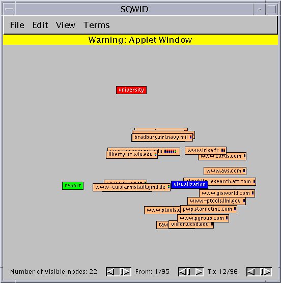
This screen shot shows the entire SQWID interface. The three primary-colored nodes contain "interesting" terms that SQWID has chosen from the query result pages. In this view, the result pages are grouped by site into site nodes and are positioned to show their relationship to the terms. These site nodes have a strong attraction to terms for which they are highly rated, but they are slightly repelled by each other so that they spread out. Nodes in the center of the triangle are attracted to all three terms. At a glance, we can see that the term "visualization", which was part of the original query, rates highly for most of the results. The other two terms were chosen by SQWID. "Report" does not tell us much about this particular query, but "university" is helpful since projects at universities are more likely to be similar in scope and content to the SQWID project.
After examining the display, we decide to replace the "report" term with something more descriptive of our interests. The menu of terms includes daqv, oregon, query, data, results, project, parallel, scientific, cis, technical, information, tools, user, and consortium. We choose "tools" since we are looking for working systems similar to SQWID. We also decrease the number of visible nodes to five so we can see the top pages for this result set, but we turn on the stress indicators so we can see where all of the nodes lie. The resulting display appears as follows.
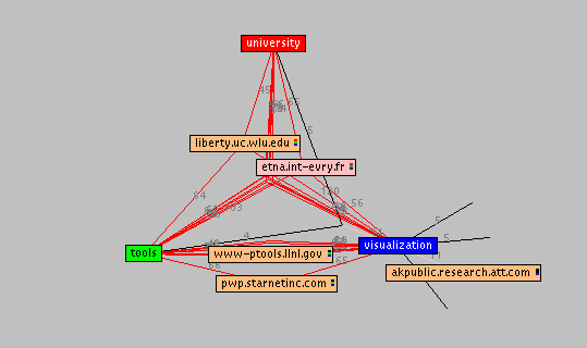
The nodes shown are the top ones overall, but the red lines meet where the other nodes would lie. We can view site summaries for these nodes by double clicking on them. Since most of the sites are related to all three terms, resulting in the nodes bunching in the center, as we increase the number of visible nodes we can spread them out. By maintaining the links we can still see how they are connected.
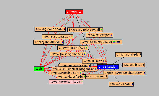
One of the most interesting sites in this graph appears to be "www.cs.oregon.edu" because it is connected to all three terms and contains 6 pages (indicated by the six small tri-colored bars). The intensity of the colors in the bars shows the quality of the matches for the corresponding search term. Double clicking on the node brings up a site summary for the six pages, all of which happen to be about the Distributed Array Query and Visualization (DAQV) system. That explains why "daqv" was one of the interesting terms SQWID had identified earlier. After visiting several sites and bookmarking pages of interest, we can delete their site nodes from the display so they will not appear in future views.
After exploring several sites with multiple pages of interest, we decide to take a more detailed view of the query results and explode the site nodes into their constituent pages. Now, each node represents a single page which (as with the site nodes) is attracted to terms for which it is highly ranked. We also change the term "university" to "query", freeze the display and spread out the results.
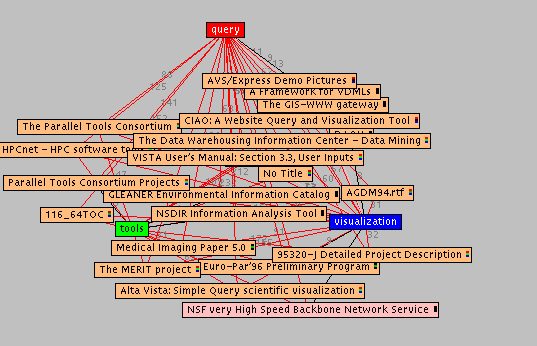
In this view we can see the titles for each page along with the tri-colored bar for the page. Double-clicking on a node will load the page into our browser. We continue this process of manipulating the display parameters and investigating interesting pages to increase our understanding of the results of this query.
SQWID uses the AltaVista search engine to generate and order its query results. We chose AltaVista over other search engines because it can order results based on specific terms. Thus, if the user's query is on "scientific visualization" and SQWID identifies "medical" as an important term, the query can be reordered with respect to "medical". Like many search engines, AltaVista provides the title, URL, size, date, and a brief summary for each page in a query result.
To identify important terms in the query results, SQWID creates a weighted index of the terms in the title. In generating the index, SQWID collects the words in the page titles, ignoring digits, punctuation, and letter case. The candidate terms are filtered using a stoplist, which removes terms that are acknowledged to be poor index terms. SQWID's stoplist includes the most frequently occurring English language words (as identified by Christopher Fox in [Fox90]), augmented with words that commonly occur in Web page titles, such as "title", "home", and "page". Each term is weighted based on the position of its page in the document list. Thus, words in the more highly rated documents are given more weight than words in lower rated ones. If a term appears in several documents, its weight is the sum of the weights for all documents. The terms with the highest weight are used to reorder the query results.
SQWID uses the order of the query results to calculate the rating for each page. The overall page rating corresponds to the position of the page in the original query results; thus, the best query match would have the best rating. Similarly, the term rating for a page corresponds to the position of the page in the query when it is ordered with respect to the new term.
Since SQWID can group pages by site, a rating for each site must be calculated. The site rating for a term is based primarily on the rating of its best page for that term, adjusted somewhat with respect to the other pages at the site. We chose to have the best page dominate the site rating to ensure that a site with many average pages does not have a higher rating than one with a few great ones. However, a site with many good pages will still have a higher rating than one with only a few.
In SQWID, the terms are represented by fixed nodes, and the pages or sites by floating nodes. Each graph contains three fixed nodes (colored red, green, and blue) arranged in a triangle. The floating nodes in the graph represent the sites or pages that were returned from the search and are labeled with the site or page name.
The system uses a tension model for the layout of the floating nodes with respect to the fixed nodes. A site that is highly ranked for a particular keyword is attached to it with shorter link than a site with a lower rank. Since the model moves the nodes to a position of least overall tension, a site node that is connected to multiple term nodes will move closest to the one for which it has the highest rank. Thus, sites which are highly rated for all three keywords will collect in the center of the triangle, those which are highly rated for two on the edge of the triangle, and those which are highly rated for one are outside the triangle, near the term for which they rate highly. Those nodes that float to the edge of the screen are not related to any of the three words. Users can move and adjust the layout by hand to uncover any nodes which are partially obscured by others. To cut down on overlap, the nodes are slightly repelled by each other and by the edges of the screen. Since the nodes are drawn in order from lowest overall rating to highest, if several nodes do overlap, the node on top represents the site or page with the best overall rating.
By limiting the number of term nodes to three, SQWID avoids the ambiguity seen in VIBE and other systems. In SQWID, if a floating node comes to rest in the middle of the triangle, its position will clearly reflect the relative attraction of the three fixed nodes. If more than three nodes were permitted, a record node positioned between several of the nodes could reflect several possible scenarios. For example, if four nodes are laid out in a square, and a single record lies in the middle, either a single pair of diagonal terms could rate equally, or all four terms could rate equally. To avoid ambiguity in an n-dimensional display, the number of nodes cannot exceed n+1.
SQWID labels the nodes with the site (or page) name, and includes inside the node a tri-colored block representing each page. Similar to the Tilebar display described earlier, the colors in the block match the colors of the three term nodes (red, green, and blue). The intensity of these small boxes indicates the rating of that particular page for each keyword. Thus, the user can see the number and quality of matching pages at each site. When a node is selected, an HTML description page appears in the user's Web browser. Each HTML page includes the tri-colored block to emphasize the relationship between the views. The user can use the summary to browse information about the site or jump to the site itself.
SQWID provides a number of controls for manipulating the view. The view menu contains controls for the visibility of links and tri-colored boxes as well as toggles for site and node views. The terms menu lets the user switch the terms shown in the terms nodes. The user can view information about nodes and delete nodes using the edit menu. The file menu lets the user save and load old queries. The sliders at the bottom control the number of visible nodes and the range of dates for the pages.
Since SQWID must access its results from a remote site, only the simplest of techniques can be applied to the information processing and retrieval. If these techniques were integrated into a search engine, they could be expanded to identify more complex relationships between the documents using more complex information retrieval techniques. With the large number of search engines available, soon we will see graphical display techniques integrated into their interfaces.