1. INTRODUCTION & BACKGROUND
Usable display of webpages on cell phones is hampered by the small size of the device screens. One method that a few sites have used to overcome these difficulties is to create sites tailored for small screen rendering, such as those written in WML or simple XHTML; some notable sites to have done this include Yahoo, CNN, and Google, among others. Nonetheless, the vast majority of sites on the web do not have customized webpages for small devices. For the success of the "mobile-internet," it is important to ensure that the vast majority of content that is easily accessible on the web through standard desktop browsers is also made available on mobile devices.
Conceptually, the approach used in this paper is simple. When a web page is displayed, it is first displayed as a thumbnail image. The image is shown divided into 9 regions. By pressing the corresponding number keys (1-9) on the phone's keypad, the user can select the region of the page on which they would like to zoom. When a particular region is selected, that region of the page can be displayed in a variety of ways. For example, it can be shown as an enlarged image that can once again be zoomed into, it can be rendered back into HTML, or it can be transcoded into WML/XHTML as the phone's browser requires. A sample page is shown in Figure 1. Note that this page is a fairly complex page with many textual and graphic elements.
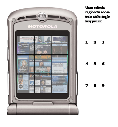
Figure 1: Segmenting the front page of abc.com (abc TV station's web site). The page is segmented into 9 equal regions, each of which can be enlarged using a single press on a phone's keypad. When this paper is printed on 8.5x11 paper, this image appears approximately the size of typical cell phone screens. Although not shown here, one implementation of this system may include a faint number 1-9 on top of the region to indicate which button to press to zoom into the region (not shown here for printing on b/w pages).
This simple approach has the benefit of allowing the user to focus quickly into a particular section of the web page by pressing a single key; no panning or scrolling is necessary. Further, although the image is rendered on a very small screen, there is a large amount of information that users can obtain just from this thumbnail, which serves as a high-level visual outline of the page, and the domain (abc.com). For example, in Figure 1, the top graphic is probably a logo or a promotion. The other graphics are most likely pictures of shows (the reader who follows popular American culture may recognize Charlie Brown as well as other TV show cast members). Finally, there are more images of other popular shows and potentially program trailers etc.
Frequently, when presented with a small screen rendering of a web page, the majority of text is not readable. The implicit assumption that this thumbnail interaction method makes is that the user is experienced with the web and some of its unstated conventions. By looking at the structure of the page, it is possible for an experienced user with knowledge of the common conventions of websites to know which region of the page is of interest; for example, navigation bars are usually in the periphery, ads usually occur towards the top of the page or are clearly demarcated, and the main body of the page is often in a coherent large block of small font. The ramifications of this assumption are mitigated in practice as we noticed that users often return to their favorite sites repeatedly; therefore, overall experience with web browsing may not be as crucial as familiarity with the set of webpages that are commonly visited. Further, when navigating web-portal pages, experienced users often know which section they are looking for before a complete reading of the web page occurs - especially with familiar portals/sites.
In this work, we start with the premise that thumbnails are useful on small screens [11]. Subsequently, the most immediate concern for the system shown in Figure 1 is the lack of intelligence employed in the segmentation. Using the simple divisions shown in Figure 1, many regions, words, and images have been mistakenly divided. If we allow for alternate approaches that permit non-uniform sized regions, there are numerous cues available to make more intelligent cuts. First, there are cues that can be obtained from the Document Object Model (DOM) of the HTML page. Second, there are sets of rules that can capture design conventions employed across a wide variety of sites. Third, there are numerous computer vision based heuristics that can be used to process the visual layout that a user would see in their browser. In this paper, we present a method for segmenting a web page into coherent regions based on clues from the DOM combined with simple computer vision algorithms. We will show that when this task is formulated as a machine learning problem, we can reduce it to a multi-label classification problem that can be addressed through known, efficient, techniques based on entropy reduction and decision tree learning.
The remainder of the paper is organized as follows. In the next section, we review related work. In Section 3, we review the essentials of entropy and decision trees. In Section 4, we show how this problem can be reduced to one that is addressable through entropy reduction techniques. Section 5 describes how computer vision heuristics are employed to further improve the results. A large number of results are presented in Section 6. The paper closes with conclusions and ideas for future work.
2. A VARIETY OF APPROACHES
There have been numerous studies exploring display methods on small screen devices. A few of the closely related ones are described here. In the first group, page splitting techniques are used to group elements of the web-page that are to be presented together. These combined elements then can either be zoomed in as a group, or may be presented linearly or in a tabbed format to a user [1][2][13][16]. These systems often avoid the need for horizontal panning. In the work presented here, we also use geometric cues, but have a further, more important, constraint on the problem. First, we need to divide the image into at most a 3x3 grid, to ensure that the selection of the region in which to zoom is possible with a single press of the phone's keypad. Second, our approach attempts to ensure that the user does not need to do any horizontal and, in most cases, no vertical scrolling.
In addition to simple zooming, systems can be designed with numerous interaction schemes with regions, such as in Wobbrock's system [3]. Here, the user could perform various operations on the selection; for example, 'picking up', zooming, and panning. This system also uses rapid serial visual presentation to support reading. This type of interaction is more suitable in cases where a thumbnail can be displayed while leaving enough room for an expansion (to show a preview of the expansion in context), and where there are easy methods to move a cursor to select a particular region. Although good for many PDAs, this approach may be difficult for the class of devices that we are targeting. In typical cell phone screens, there is not enough room (or resolution) for the thumbnail and expanded region, and moving the cursor to the initial region of interest must be accomplished through successive button presses, which is likely to be become unwieldy quickly.
In interesting related work with thumbnails, Hedman et al. [5] explored the use of three thumbnail browsing techniques: simple iconic, zoom-and-pan, and fisheye [4]. Although explored in the context of finding information from multiple pages (or files), the results showed a simple iconic browser worked best, and that younger participants in their study (20-25) were significantly faster than older participants (31-53). Fisheye views with popouts have also been explored (as may be used in conjunction with search terms) [15][11].
The most closely related work to the study presented in this paper, the VIPS algorithm [6][7], split the page into smaller blocks based on DOM or visual cues. VIPS extracts nodes from the DOM tree and then finds vertical and horizontal separator lines between the nodes. Regions can be divided based on a number of handcrafted rules. Each region is assigned a degree of coherence that is based on visual properties of the region including fonts, colors and size. This work was extended to assign features to each of the regions (such as spatial features, number of images, sizes, links, form info, etc) that were then fed into a Support Vector Machine to assign an importance measurement to them. The importance measurement was used to order the display of regions for single column display. This system is the most similar to the one presented in this paper; here, we use visual similarity as well as measuring the number and prevalence of distinct elements in a region to create coherent segmentation regions. Further, to facilitate easy navigation using a cell phone's keypad, we attempt to bias (but not hard constrain) the selection of regions towards equal sized regions.
There are numerous other approaches designed to enhance browsing webpages on small screens, but they are less related to the system presented here. They include device specific authoring, automatic re-authoring, and summarization based approaches [14]. A good overview, and a system that combines some of these approaches, can be found in [12].
2.1 Pros & Cons of Different Approaches
Three approaches were considered when building the web page segmentation system. A description of each is given below, along with its associated benefits and drawbacks.
1. Simply divide the image into 9 equal rectangles:
- Pros: Fast, easily understood by the end user.
- Cons: Extremely disruptive, can sever words, sentences, images and regions.
2. Vision-Based Techniques: use computer vision techniques such as simple blob-detection and region coherence to find which regions should be kept together.
- Pros: better at keeping salient portions together, especially when the portions are noticeably different colors (for example, a region is highlighted or has a different background).
- Cons: Does not take into account the DOM of the web page; therefore, no notion of which regions are more important to keep together. Will not work on simple pages: if the regions are not visibly different, this method may not work as well.
3.DOM-based segmentation:
- Pros: Depth and type of the node in the DOM gives an indication of how much it should be kept together. May capture many of the benefits of the vision based techniques, as if there is a background that is different, it can appear in the DOM.
- Cons: Examining only DOM elements may not capture obvious visual cues and may make distinctions between regions that appear similar. Further, this technique may require some basic computer vision techniques to resolve uncertainties of where to place cuts between DOM nodes.
3. DECISION TREE-BASED LEARNING
In this section, we will briefly review the concept of entropy and how entropy measurement is used in decision tree learning. In Section 4, we will use entropy measurement in the context of decision tree learning to choose the best segmentation of the web page. Readers who are familiar with entropy and decision tree construction should go to Section 4. More detailed overviews of decision tree learning can be found in [8][9][10].
In their simplest form, decision trees are used to learn classification problems. For example, given a set of attributes about a person's credit history, a decision tree can be used to determine whether or not that person will be approved for a loan. To build a decision tree, we use the notion of entropy. Entropy is a measurement of how much randomness there is in a signal, or a measure of "disorder" of a system. For discrete events, we define entropy as:

Here, Y is a set of examples that can be assigned one of C classes, and pj is the probability of an example being in class j. To provide a concrete example: imagine that Y is a set of outcomes from a coin flip. In the first case, it can have one of two values (C=2) with equal probability; in a sufficiently large sample, we obtain 50% heads and 50% tails. The entropy is -[0.5*log2(0.5) + 0.5* log2 (0.5)] = -[-0.5 + -0.5]=1.0 (maximum entropy). If the coin was weighted to land heads up 80% of the time, the entropy would be reduced because of less randomness in the outcome. The entropy would be -[0.8 * log2 (0.8) + 0.2 * log2 (0.2)] = -[-0.26 + -0.46] = 0.72. Finally, we note if the coin was weighted to land heads up 99% of the time, the entropy would decrease further: -[0.99 log2 (0.99) + 0.01* log2 (0.01)]= -[-0.014 + -0.067] = 0.08. As the randomness decreases, the entropy decreases.
A decision tree is a tree-based model of data commonly used for classification. Each interior node is labeled with a feature (or combination of features) and each arc out of an interior node is labeled with a value for the node's feature. In the leaves of the tree is a classification. When a sample comes into the tree to be classified, the sample is 'routed' down to a leaf based on the values of its features (or combination of features) at each node.
To construct an effective decision tree, we need to decide which feature should be examined at each node (examining features which are not relevant to the task of deciding the classification is not useful). The feature chosen at each node is the one that provides the most information about the target category. We ask the following question: if we know the value of a feature, how much information does that give us about the classification of the samples? To measure how much information a feature gives us (the Information Gain), we look at how much knowing a feature X's value reduces the overall entropy. Information Gain is:

The conditional entropy term, H(Y|X), is defined as:

The conditional entropy simply looks at the entropy of each set of points, where the set is defined by the points that have attribute X set to vk. The entropy of that set is multiplied by the probability of that set occurring (the first term: P(X= vk)). When the conditional entropy is computed, it is subtracted from the overall entropy -- thereby telling us how much information we gained (how much we reduced the entropy) by knowing the value of X.
A decision tree is built top-down. As it is built, the number of samples classified at each node is a subset of those that reach the node's parent. At each node, only the samples that have met all of the node's ancestor's conditions are examined. Therefore, each node's feature is selected based on only the samples that would have made it to that node. The head of the tree is based on all the samples, as all samples pass through it.
An example is shown in Figure 2. The goal is to classify the samples into a classification of '0' or '1', as shown in the diagram. In this example, a point has two attributes, its X & Y coordinates. The first split is a vertical line; the question to split upon is 'Is the X-Coordinate of the point > 9?'. This is the test conducted in the root node of the decision tree. If the answer is 'yes', the point is assigned a '0' label. If the answer is 'no', the decision tree is continued. The second decision node is only reached if X ≤ 9; here we ask the whether Y < 4? If 'no', then the label is assigned as '1'. If 'yes', the third split is reached. The third split is only relevant in the subset of cases where X ≤ 9 & Y < 4; the third split asks whether X > 5? If it is, a label of '0' is assigned, if not, '1' is assigned. The decision tree is stopped here since all the points are classified.
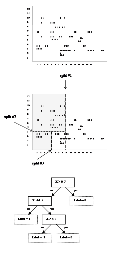
Figure 2: Top: data to be classified with a decision tree. Middle: Three splits to divide the data. The shaded areas will be classified as '1' the non-shaded as '0'. Bottom: A possible decision tree to classify the points.
Note that there is a dividing line (diagonal) between the 0's and 1's. However, we only allow axis-parallel splits (these only look at the value of a single variable - either X or Y). Although decision tree learning is not dependent on this, axis-parallel splits are employed in the formulation described in the next section.
We have clearly omitted the complexities of creating a decision tree that works well in classification tasks (such as overfitting vs. allowing some errors to occur in training, pruning the decision tree, etc). Nonetheless, this provides enough of a foundation to reduce the segmentation problem into a decision tree framework.
4. SEGMENTATION AS ENTROPY REDUCTION
In this section, we will show that good segmentations of the web page can be obtained by reducing the problem to a classification task and using an analogous procedure to learning a decision tree as the classifier. The conceptual transformation is as follows:
- Consider each DOM element of interest to be a separate class. The goal of the decision tree classifier is to select splits of the page that help to determine which DOM-element (class) the user is looking at.
- The probability of a class is defined by the area (in pixels) of the DOM element that it represents. The larger the DOM element, the larger the probability that we are looking at the element.
- Each classification point has attributes associated with it. At each node in the decision tree, attributes are chosen to split the data. Similarly to the example shown in Figure 2, each pixel in each DOM element has two attributes associated with it: its X & Y coordinates.
- Following #3, since there are only two attributes for each sample point, there are only two attributes that can be chosen to help discriminate the classes: an X value or a Y value. As in the previous example, we limit the cuts that we consider to a single value (either X or Y) to ensure all cuts are parallel to an axis.
- To select the first cut, consider all possible lines (every horizontal and vertical line). Select the cut that provides the maximum Information Gain (as defined in Section 3), in terms of discriminating classes, over no cut at all.
- Based on the previous cut, recursively cut each
subregion. Instead of considering all possible lines (in
X&Y), only consider those that are within the subregion
being cut. Select the line that provides the maximum
Information Gain for the subregion being examined.
Terminate the recursion when there are 3 regions horizontally
and 3 regions vertically.
- A. After making a cut, Q, another cut in the same direction may be needed for the termination condition to be met. The cut should be made in the larger of the two regions created by Q.
- B. After making a cut, Q, a cut in a different direction may be needed for the termination condition to be met. The cut should be made in both of the regions created by Q.
- Unlike standard decision trees, at termination, classes need not be assigned to the leaves; the page segmentation is complete.
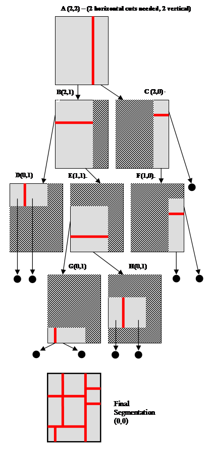
Figure 3: The recursive segmentation process. Each step is shown in detail. The number in parenthesis shows the number of horizontal and vertical cuts (respectively) that remain to be done for the region being processed. To correspond to the phone's keypad, we need 9 regions; therefore, we make 2 cuts horizontally and 2 vertically, so the initial image (A) starts with (2,2). In each image, the grey region is the region that must be cut, the striped region is not considered for cutting. The final segmentation (shown at the bottom) displays the combined cuts organized onto a single page. Arrows ending with a circle indicate that no more cuts are required for the region.
Section 4.1 describes the recursive procedure. Section 4.2 describes how to select the places to cut by looking at the DOM.
4.1 Recursive Segmentation
The recursive segmentation procedure is easiest to visualize through a diagram, see Figure 3. In order to obtain a 3x3 segmentation of the web page (to correspond to the layout of the 1-9 keys on cellphones) we will need to make 2 horizontal and 2 vertical cuts, denoted by (2,2). In the example shown in Figure 3, the first cut chosen (see Figure 3-A) is a vertical cut. We then repeat the cut selection process for each of the subregions specified by this cut. After the first vertical cut is made, only one more vertical cut is required. Since the left branch (B) is the larger of the two (in terms of width), it will be cut again vertically. B also has two horizontal cuts remaining. Therefore, the cut requirements for B are denoted by (2,1). Since the right branch (C) is the smaller of the two, it will not need to be cut again vertically, but still requires two horizontal cuts (2,0).
Moving down one level in the recursion, B is cut horizontally. Since the top of the B cut is smaller, it has no more cuts horizontally, but still has 1 cut vertically - as shown in D (0,1). The bottom of the B cut is larger, so it can again be cut horizontally, and it still has a vertical cut remaining E (1,1). For the cut in C, note that the top is smaller than the bottom, so it will not be cut again horizontally. Therefore there are no more cuts for the top portion. For the bottom portion of C, it can still be divided again into two vertical sections (F).
In the third level of recursion, D (0,1) still has a vertical split to be placed. Once it is placed, no more cuts are required, so this branch of recursion is done. F (1,0) is cut horizontally since it had 1 remaining cut; now there are no more cuts to be made in this branch, and this branch is terminated. E is divided horizontally. Remember that E still had a cut remaining vertically. Therefore, E's children (G&H) still must make that cut. In the final step of the recursion G(0,1) & H(0,1) are further divided. Since G & H have no more cuts to make, the recursion terminates fully.
Finally, all the cuts are placed back together onto the web page. The result is the segmentation for the page.
4.2 Using the DOM for Entropy Calculation
The basic premise of this approach is that if we consider each DOM element to be a separate class, we would like to find splits on the page that maximally increase the amount of information that we have about which region the user is looking at. This is analogous to decision tree learning, in which we select features to divide the space of examples such that the diversity of classes in the leaves of the decision tree is minimized.
Stated in another way, imagine throwing a dart at a web page. You need to guess which DOM element it hit. What bit of information could I give you to help you guess? This algorithm finds bits of information of the form of either "the dart was above/below a line" (or equivalently for vertical splits "the dart was to the left/right of a line").
This approach is analogous to creating a decision tree with axis-parallel splits of the data in two dimensions.
To make this concrete, let's look at some real examples. Figure 3 (top) shows a snapshot of the Slashdot web site. Figure 3 (bottom) shows the different DOM elements on the web page that we use in this algorithm (the colors are chosen randomly). The arrows show the top choices of places to split vertically and horizontally. Both of these choices provide the most information in each dimension. For example, in the case of the vertical split, note that if the dart fell to the right of the line the set of DOM elements that it is likely to have landed in is largely disjoint from the elements on the other side. Similar is true for above/below the horizontal split line.
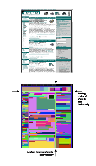
Figure 4: The Slashdot (http:/slashdot.org) web page and an extracted DOM representation (bottom) (note that major DOM elements shown for clarity). The colors in the DOM element are randomly chosen to demarcate the different DOM elements found. The arrows on the left and right are the leading choice of places to split horizontally. The arrows on the top and bottom of the DOM are the leading choices, based on entropy, of where to split the page with a vertical cut. Note that some of the DOM elements (for example at the top) will be cut.
5. FINE TUNING
The decision tree based segmentation provides the crucial component of obtaining splits that are the most informative while dividing the fewest number of DOM elements. There are a number of heuristics that can be used in conjunction with the cuts found by the entropy reduction procedures. A few of these are integrated into the system presented here; they are described below.
Bias on size of segment: We may want cuts as close to 1/3, 2/3 as possible, to ensure that the regions are close to the same size. This can simply be added as a variable multiplicative penalty term that has its low point around the 1/3, 2/3 points for when 2 cuts are needed, and the 1/2 point when a single cut is needed. For example, the further away a cut is considered away from the 1/3 or 2/3 division, the more it can be penalized. Intuitively, this ensures that there is a compelling reason to make a cut away from 1/3 or 2/3.
Which DOM element to cut? If we have to cut through a DOM element, is there a priority regarding which DOM elements are best to cut, and are there elements that absolutely should not be cut? Although we can easily create priorities such as "its better to cut through Table Cells than Bold tags", we have found a much simpler heuristic: if a DOM must be divided, the higher it is in the DOM tree, the better it is. Extreme cases provide the best examples: At the highest level of the DOM is the <body> tag. We know that we will have to divide this. At the lowest level in the DOM tree might be a <bold> tag; dividing a bolded region may be disruptive since a word, sentence or heading may be cut. We bias our cuts to overlay on the highest possible DOM element. This is accomplished as follows: for each pixel that is covered by a cut, compute the depth of the lowest DOM element (in the DOM tree) that is present on that pixel. The average depth is computed across the line, and lines with smaller averages are preferred (i.e. if it had an average depth of 0, it only hit the pixels that were on the BODY tag).
Exact Placement of the Segmentation Line: As described to this point in the system, our computations have been on the DOM and on a depth-map of the page based on DOM depth. From the original image, we take hints from computer vision literature and compute the entropy of each cut line as well. This measures how many different colors/intensities the scan line covers. Imagine trying to split a graphic: if the scan-line's entropy is high, information is covered. If it is low, there is little information contained under the line. In our case, if the entropy is high, the cut-line may be hitting a word or a graphic. If the entropy is low, we suspect that the line is in a fairly homogenous or blank region; therefore, cut lines over pixels with low-entropy are preferred.
Always segment into 9 regions? Some pages may not require 9 segments; we should be able to detect these cases. Interestingly, the decision tree framework provides an elegant and intuitive manner to stop the splitting early: if there is not enough information gained by making a split, then we do not force the split to occur. This heuristic will allow coherent regions to be kept together, rather than forcing unwarranted splits. We instantiate this heuristic by enforcing that if a cut is made, it must have at least a minimum amount of information gain over not making any cut.
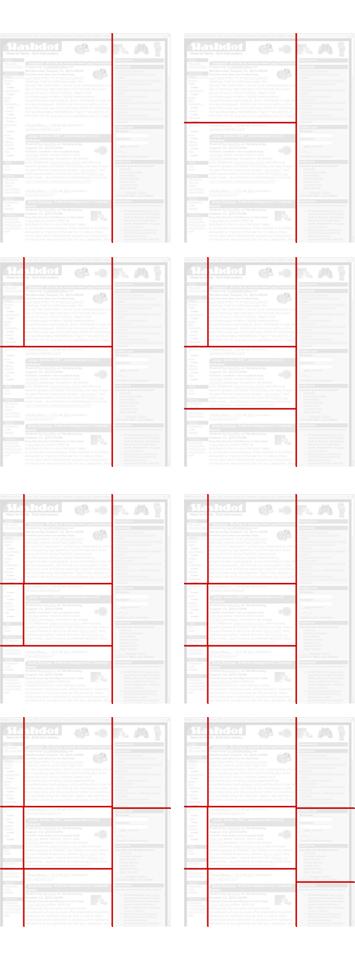
Figure 5. A step-by-step examination of the order in which the Slashdot page is segmented. The order proceeds from left to right and then down. The original image is shown in Figure 4. Note that in this case, all 9 cuts are made. Also note that sometimes images must be cut (the Slashdot logo on top-left) to preserve coherence of the remainder to the page. Final segmentation is on the bottom right.
5.1 Parameter Interactions
The measure of entropy, as described in Section 4, plays the largest role in deciding the split lines. The heuristics described in the previous section serve to fine-tune the results. Of the heuristics described, the largest weight is given to using priors on the cut size selection -- to weight the cuts towards equal sizes. Although the overall weight of this heuristic is small in comparison to the entropy of the cuts, it effectively serves to ensure that too small regions (for example, under 10% of the page width/height) are not created.
Additionally, the heuristic of not always choosing to make a cut is also employed. The threshold for making a cut is that the magnitude of the Information Gain for the candidate cut must be more than 40% of the Information Gain for its parent cut.
In setting these parameters, there is the concern of over-fitting the settings to the small number of examples on which the experiments are conducted. To avoid this problem, we manually tuned the parameter interactions only on a subset of webpages included in our experiments (the train-set). Although there were only a few parameters to tune, we wanted to ensure that the settings found worked well on webpages not used for training. We tested the settings on an independent set of webpages (the test-set). In the next section, we will describe the results on some of the webpages in our test-set. Figure 5 shows a step-by-step example of the complete segmentation process of the Slashdot page shown in Figure 4.
6. RESULTS
In this section, we describe some of the results with the web page segmentation system. In its current form, the segmentation can occur on a proxy server between the requesting phone and the website at the time of a page request. Alternatively, because of the compact segmentation representation, pre-computing and storing the segmentation is a viable option. This algorithm was tested on a variety of webpages, including portals with an enormous amount of content on a single page (Yahoo, MSN), Google search results pages (including Froogle, Images, etc), Blog pages, eCommerce sites, and university home pages (which often consisted of simple text and links with no formatting).
Figure 6 shows the results on sites with large amounts of content (BBC, Coppermine, Lonely Planet, HP-Shopping). In Figure 6, the original page is shown on the left, the segmentation in the middle, and a view of DOM elements considered on the right. Several points should be noted. First, it is readily apparent from these results how this approach differs from previous approaches that tried to extract only coherent regions from page. Here, we are tackling a specialization of that problem geared towards fast interactions on cell phones: dividing the page into at most 9 regions that are spatially divided in a 3x3 grid -- while maintaining as much coherency as possible.
Second, the division in Coppermine (B) & Lonely Planet (C) show the effectiveness of not always making all possible divisions. For example, the division of the bottom-left of the Lonely Planet page (region '4') into three vertical regions would not be beneficial as there is no information contained in the bottom-left portion of that region (it is empty). Therefore, in our formulation, the information gained by making this division would be below the threshold.
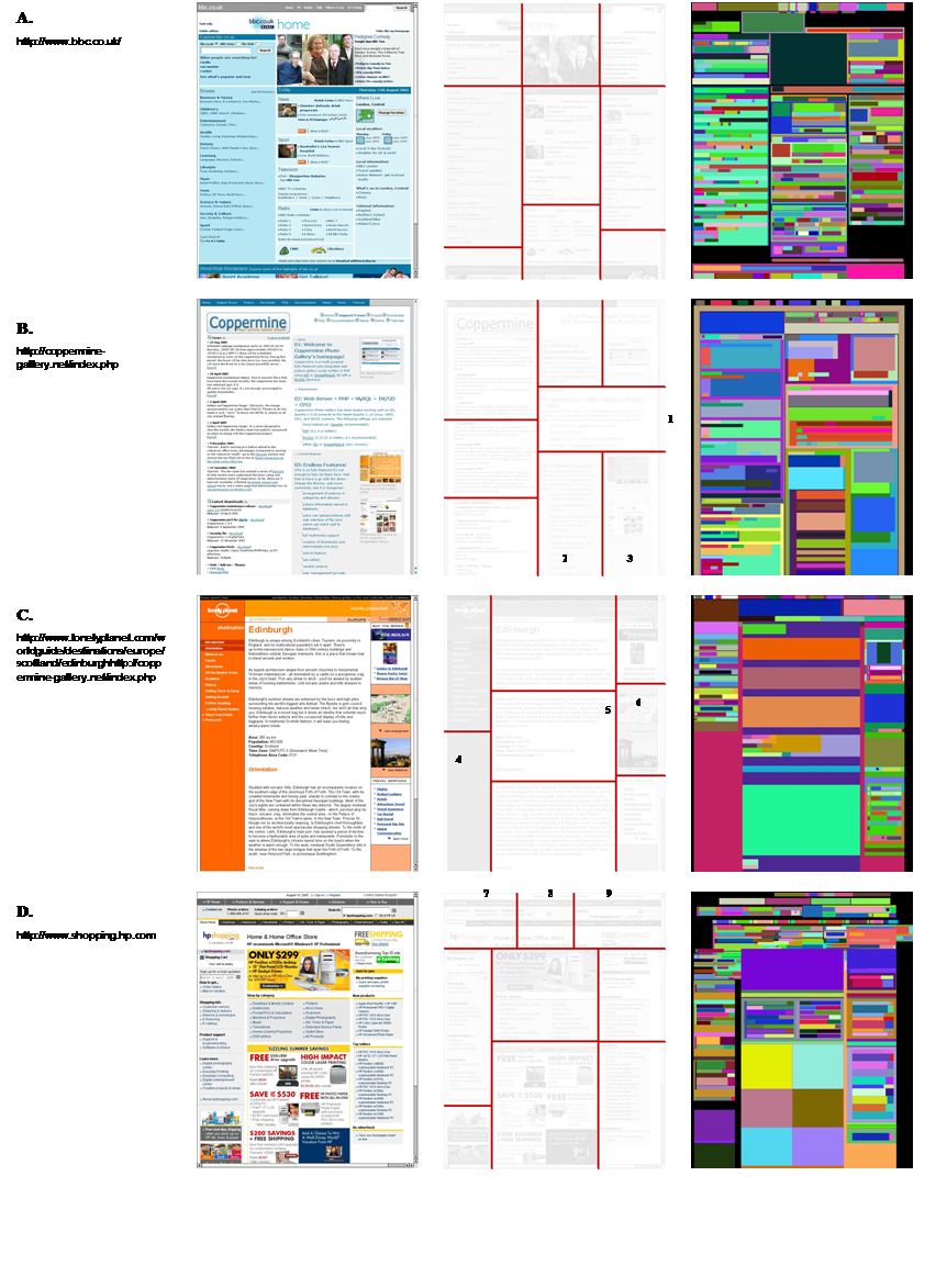
Figure 6. Four examples of segmentations from complex pages. Columns: Left: Original Image, Middle: Segmentation (shown faded to ensure that cuts appear clearly), Right: DOM elements, shown with random colors. The numbers (1-9) are regions that are referred to in the text.
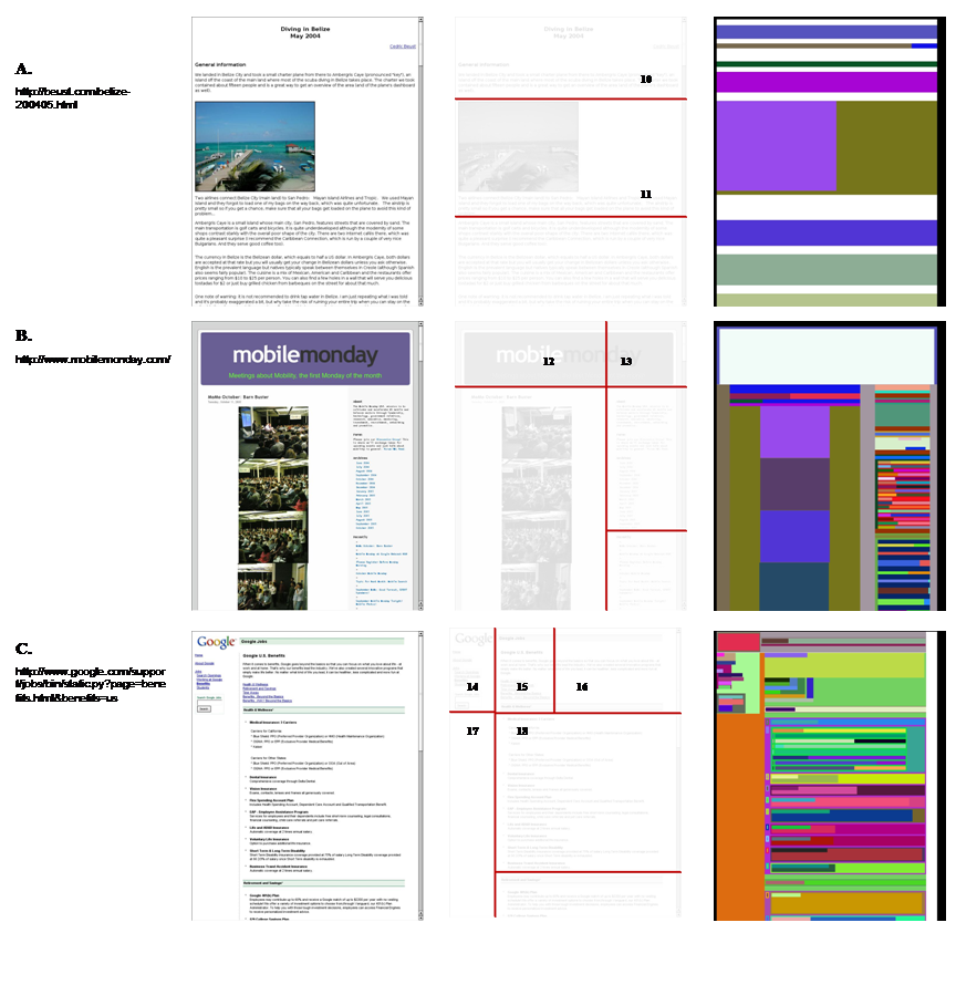
Figure 7. Three examples of segmentations from simple pages. Columns: Left: Original Image, Middle: Segmentation, Right: DOM elements, shown with random colors. The numbers (10-18) are regions that are referred to in the text.
Third, not all coherent regions will be kept together; rather, the regions that are chosen should have a high degree of coherency. Because the goal is to divide the page into regions into which a user may zoom, there is a tradeoff made between keeping coherent regions together and providing smaller regions in which to zoom. This is evident in the Coppermine page. In the right half of the page, region 1 is not subdivided into two. This is preferred because the text in that region extends across the entire region. However, in examining region 2 & region 3, although the content is related, the region is split. This occurs because the goal of this work is to find small regions in which to zoom, and there is enough different information in regions 2 & 3 to warrant a split. If, on the other hand, we wanted to keep these regions together, we can modify the algorithm to incorporate a weighting term that penalizes splitting apart regions that contain only DOM descendents from a single direct parent. Although this is not within the goals of this work, this approach may be used for tasks such as segmentation of a page to find its most salient regions.
This same tradeoff is seen in regions 7, 8 & 9, where the top section is divided into multiple groups. Again, although it is a single section, the number of unique elements not overlapping the boundaries indicated that cuts between the regions still provided enough unique content to make the cuts useful. .
In Figure 7, results are shown for three simpler webpages. Note that in comparison to the pages shown in Figure 6, there are far fewer cuts. For example, in regions 10 & 11, no vertical cuts are made. This type of web page is a typical simple web page that has minimal formatting and presents text in a single flow.
The simpler webpages shown in Figure 7 also provide the opportunity to clearly elucidate the limitations of this approach. In the page from 'MobileMonday' (Figure 7B), note the vertical cut that divides regions 12 & 13 divides the graphic. Had the horizontal divide that separates the logo from the lower part of the page been made first, the vertical cut would not have extended into the graphic. The vertical cut was made first (and thereby extended across the entire height of the page) because the number of DOM elements successfully segmented into the left and right of the dividing line was quite large (as can be seen by the third column of Figure 7B), and the area of division was big. This provided a large amount of information gain. Because each cut is made in a greedy manner, this can lead to local optima in the overall cuts. If a global measure was employed, this order of cuts would not have occurred. However, in general, such global heuristics are likely to be too computationally intensive to be used in a live deployment.
Finally, in the 'Google Jobs' page (Figure 7C) there are several points of interest. The first is the reason for the existence of region 15. There are enough DOM elements (links) that fall completely in region 15 that separating it from region 16 provides a coherent region to zoom into. The tradeoff is that the text above the links is split. This is similar to the problem described in reference to Figure 6D; although the split regions are largely coherent, some coherent regions are split. The willingness to make this tradeoff is set by the weight of the heuristics used. A second point to note is that the line separating regions 14 & 17 is slightly offset from the line separating regions 15 & 18. This occurs because there is no "aesthetic" heuristic guiding the splitting process; no penalty is given for offset regions. However, in practice, such a heuristic may yield more pleasing divisions; this is left for future work.
7. CONCLUSIONS & FUTURE WORK
The most immediate next step for this work is to perform formal user studies. To date, user studies have been positive, but have been largely anecdotal. Formal studies will be focused on task completion times of common searching tasks drawn from the behavior of users on Google's Mobile Search site. The studies will encompass two components: measuring the benefit of a zoomable thumbnail image over a transcoding of the HTML page, and measuring the benefit of intelligent divisions in comparison to the simple nine equally sized rectangles approach.
In addition to the user studies, there are a number of ways to improve the segmentation system: (1) Alignment across regions: introducing aesthetic constraints may improve the subjective feel of the system. In many cases, it may be possible to adjust the regions to minimize the number of small offsets without changing the content of the regions (such as shown in Figure 7C). As mentioned earlier, no global aesthetic measures such as this have been employed yet; nonetheless, numerous measures are possible. (2) Incorporation of Heuristic Rules: there are numerous heuristic rules that can be incorporated. For example, we may decide to ignore some of the DOM elements, or pay more attention to other elements. (3) Adaptive parameter setting: In its current implementation, the weighting of the heuristics remains constant for all of the pages processed. However, different types of pages (e.g. parameterized by the amount of text vs. images, number of DOM elements, use of tables, length, etc.) may benefit from different weightings. For example, currently, long pages are handled the same as short pages; simple heuristics can be used to adapt the system's behavior by a priori choosing to make fewer cuts for short pages (i.e. 2x2 or 2x3) or by pre-dividing lengthy pages based on the user's screen resolution. Further, it should be possible to adapt the system's parameters by performing high-level statistical analysis of the page before segmentation.
8. ACKNOWLEDGMENTS
This work has greatly benefited from interactions with Steve Kanefsky and Bill Gibbons. Many thanks are also given to Bill Gibbons who wrote the DOM-extractor that is used in this work. Thanks are also given to Maryam Kamvar and Kaari Flagstad Baluja for their in-depth comments on this paper.