1.INTRODUCTION
People want spatial information to be available anywhere and anytime. The progress in the field of mobile communications and mobile devices, which was achieved during the last years allowed the development of map applications, addressed to the users of handheld devices.
Several map applications for mobile devices have been developed following different approaches. The most popular approach is the client side approach. In this case the user is required to download the application to his mobile device in order to use it. All these applications fail in one point. They are not device independent. They are designed either for mobile phones or for PDAs, but not for both. Sometimes they may require a JAVA enabled device or an i-mode device. Moreover, very often the user is required to download special software and install it in his handheld.
We present a web based device independent mobile map application: the m-CHARTIS system. It is designed in a way so that it can be accessed by a wide range of mobile devices, a fact that makes it device independent. It is consisted by two parts. The first part is used by the administrator of the system, providing him/her with the possibility to import information to the system and requires the use of desktop computer. The second part, which is specially designed for mobile devices, allows the mobile user to access the maps and the information that the administrator has imported in the system. We will focus on the mobile application.
2.DEVICE INDEPENDENCE
Mobile devices, in contrast to personal computers, are constrained by important limitations that impose severe difficulties to the interaction with the user[1][2]. Screen size, resolution, number of colors, limited computing power, storage space, low data transfer rates and interaction difficulties are the most important constraints. Although handheld devices are constantly improving technologically, the developers of applications addressed to mobile users should take into account these constraints.
Concerning our application, we have chosen the web based approach (simple web pages), so that the storage and processing of data takes place at the server's side. In this way we deal with the limitations of low processing power and low storage capability of devices. Furthermore, any mobile device that is equipped with a browser, a feature that nowadays almost all devices offer, can use our application, as all pages are XHTML Mobile Profile valid. XHTML MP [4] is a subset of XHTML, specifically designed for mobile devices and it is a standard proposed by Open Mobile Alliance. In addition, using the application does not depend on the connection service to the Internet. The pages are also designed to have the smallest possible size. For example, the page in which the map is presented, when the size of the map image is 176x220 (typical for a smartphone) is around 9 KB. When the size of the map image is 128x160 (typical for a mobile phone) the page is around 6 KB. With this feature we deal with the constraint of low data transfer rates of the network and the pages can be accessed even from devices with limited memory. In addition, we also minimize the cost of accessing the page. Finally, thanks to the possibility of changing the size and the zoom level of the map, the user is able to adapt the application according to his/her device screen capabilities.
In order to confirm that our mobile application is indeed device independent, we have tested it with different devices that cover all categories and have different capabilities such as mobile phones, smartphones and PDAs.
3.THE m-CHARTIS MOBILE APPLICATION
The web-based application, which is addressed to mobile users, allows them to access the maps and the information that has been imported in the system.


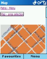
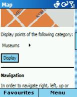
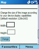
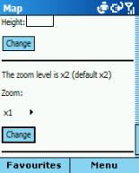
Figure 1. The page for mobile users where the map is presented (screenshots from Qtek 8020 smartphone)
In the main page the user selects one of the available cities and next he/she proceeds to the city's index page. From there he/she may choose to read general information for the city.
Another option is "map navigation". The user may start navigating from several pre-specified points (startpoints). After choosing one of them, the browser loads the page with the map centered at the respective point. This page is shown in figure 1. The default size of the map image is 128x160 pixels, but the user may change it according to his device's display capabilities. There are also four zoom levels to select the one that suites her/him best. If the user changes once the zoom level or the size of the image, the application will "remember" the new settings. In this way she/he does not have to re-enter these settings again. Moreover, keys 2,4,6,8 function as acceskeys and allow moving up, left, right and down on the map respectively. In case the device does not support accesskeys, navigation on the map is alternatively accomplished with the respective links.
Finally, there is also the possibility to display all the points that belong to a specific category.
Another option available in each city's index page is "search point". The user may search either for all points that belong to a specific category (e.g. museum) or for a specific point. In the last case the search criterion is the point's title. If there are any results found, the user, after selecting one of them, is transferred to the page in which a map with the point and the registered information are presented. In this case, there is also the possibility to change the size and the zoom level of the map and to navigate through it.
The last option available in the city's index page is "search street". The system uses for the query the name of the street which the user is searching for. If this street is found in the geographic data files for this city, the system splits it in segments and presents as options those segments that are closer to startpoints, so that the user may see the map with the respective segment of the street. This approach is followed because a street may extent to a long length and we want the user to be able to see the parts of the street that belong to different regions.
We have designed all pages of the application for mobile users according to the design guidelines for mobile web pages described in [3]. We use the same style for all pages. Each page is divided in discrete parts: at the top of the page there is the part with the navigation links; then, the part with the main informational content; finally, the part with the input forms. In general, all pages are small so that scrolling is avoided. Each page also has a representative title, so that the user knows which part of the application is accessing. Finally, the entering text method is automatically changing to the appropriate type. For example, if a form requires numerical input, the input of the device is automatically changing to numerical (when this functionality is supported by the device and the browser). This feature helps the user to save time and makes the application more functional.
4.CONCLUSIONS AND FUTURE WORK
We outlined the m-CHARTIS system, a web based device independent mobile map application. We aimed, through this application, to provide the user with the possibility to navigate through maps and to access the information registered in the system. We emphasized on device independence, as current applications for mobile devices do not take into consideration this important, in our opinion, point.
In the future we intend to perform an evaluation and user assessment of our application in order to determine its weaknesses and try to improve them.
5.REFERENCES
[1] Kaikkonen, A., Roto, V., Navigating in a Mobile XHTML Application. In Proceedings of SIGCHI 2003, pp.329-336.
[2] Paelke, V., Reimann, C., Rosenbach, W., A Visualization Design Repository for Mobile Devices. In Proceedings of the 2nd International Conference on Computer Graphics, Virtual Reality, Visualisation and Interaction in Africa, 2003, pp. 57-62.
[3] XHTML Guidelines for Creating Web Content, 2005, Nokia Corporation.
[4] XHTML Mobile Profile and CSS Reference, 2003, Openwave Systems