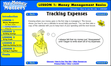
Figure 1. The overall layout of the site: navigation in the top and left blue areas; content in the white middle area.
Starpoint Solutions was contracted by a major North American bank to design, develop, and usability test a series of five Web-based, interactive lessons teaching low- to middle-income people the basics of money management and financial independence in a classroom setting. The target audience is expected to have little or no experience with the Web or computers. Each of the five lessons had a character guide associated with it. These guides provided personal commentary from their fictional financial situations and were often integrated into interactive games and exercises. Subjective findings agreed with previous research, which has shown that the use of characters in user interfaces can greatly enhance the user experience - especially with people who may lack confidence and a sense of control. These traits were observed in usability testing participants and are expected to be common among novice end users.
Usability, usability testing, human factors, education, training, characters, novice users, Web, Internet
Starpoint Solutions (formerly, TIS Worldwide) was contracted to conduct usability testing of Lessons One and Two of the My Money Matters Web site - a community outreach effort of a major North American bank. My Money Matters is a series of five Web-based, interactive lessons designed and developed by Starpoint Solutions to teach low- to middle-income people the basics of money management and financial independence in a classroom setting. It is expected that community centers, such as the Young Men's Christian Association (YMCA), will offer the class as part of their ongoing self-improvement programs.
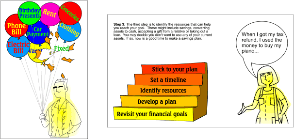
Characters were integrated into the curriculum and content design as guides throughout the site. Each of the five lessons was associated with its own guide, and each guide had a financial situation with which the expected users could relate (i.e., repaying student loans or turning a hobby into a source of income). Figures 1 and 2 provide examples of the interface design and use of characters. The characters were not animated and "spoke" to users via dialogue bubbles, providing personal commentary from their lives, as seen in Figure 1 and the right side of Figure 2. Characters were also integrated into some of the games in the lessons; the left side of Figure 2 shows a balloon popping game that illustrates the differences between fixed and flexible expenses.

Figure 1. The overall layout of the site: navigation in the top and left blue areas; content in the white middle area.

Figure 2. Examples of the use of characters. On the left, Bob Banks is integrated into an interactive game. On the right, Sally Spender provides personal comments from her financial situation.
It was expected that the use of characters would positively affect the user experience. Previous research has shown that even simple line drawings " are quite enough to activate a psychologically rich response" and that people often react to media characters " and interact with them in exactly the same way they would with real people." [1] More specifically, Rickenberg and Reeves conducted a study of the effect of characters on users' responses to an interface. They found that "the addition of characters may make interactions more robust " for users who lacked confidence in their ability to complete work on their own and who lacked a sense of control over their own success [2]. These traits were observed in usability testing participants and are expected to be common in the target audience of this site.
Usability testing was conducted on Lessons One and Two. Seven women participated in the test. All of them were part of a welfare-to-work program and were representative of the predicted user audience - namely, no-to-low computer skills and low- to middle-income. In addition, all participants were eager to learn more about managing their money.
Participants were tested in pairs, with an educational technology professor serving as the class instructor. This testing format was used, because it better represented the socially interactive environment of the classroom setting expected for the final rollout than traditional, one-on-one usability sessions. Participants were engaged by the characters from the moment they were introduced in Lesson One. Level of engagement was determined by moments when the participants smiled at, laughed at, or even talked to the guides. An unexpected finding was that some participants did indeed talk directly to the guides. For example, when the guide for Lesson Two, Sally Saver, was introduced, one participant said to her, "OK, Sally, let's see what you can do." Participants commented that they "really liked the characters guiding me through the site" and that meeting the characters "was cool."
Results from subjective responses of users and observations made during testing appear to agree with the research referenced earlier. Namely, many users interacted with characters in manners similar to interacting with real people. In addition, users were highly enthusiastic in their responses to open-ended questions in the post-test questionnaire, reporting that the site was extremely fun and made them want to learn. Perhaps, as Rickenberg and Reeves state in their paper, the use of characters in this educational site did indeed " turn up the volume on social presence, which means it can accentuate the effects of everything presented" - ultimately leading to a more engaging, involving user interface. [2]